Friday, July 27, 2012

Buttery Goodness

Just so you guys don't think I'm a total color junkie, I decided to something a little more sedate. This may sound goofy, but I look at a piece and let the color speak to me. Huh?? Ok, break out the tarot cards. No, I mean, I never like to go against the piece. I don't want to force it to be something than it really is. Ok, I sound like a complete whack-job. I like to wear those nice white coats with the funny sleeves!  No, really, I just like to keep it real. Oh shut-up already.   Here is the newest member.

Not really sure why my dog is tasting the mirror. 

So I found this off of CL (surprise!). The entire piece is veneered in birds-eye maple.
I haven't seen this type of dresser done in this wood. Usually it's oak or mahogany. 
It wasn't in terrible shape but the veneer wasn't all that great that I would have wanted to leave
it unpainted. At some point it had been painted white and the people I got it from stripped 
down to it's original state. They didn't do all that bang up of a job. 
 There was some water damage and the veneer was lifting pretty good along the bottom.
Glue and wood filler fixed this issue. However, I had no choice but to paint it now. 


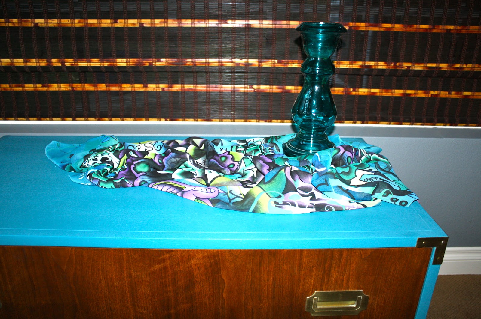
Here's a quick peek after waxing in the garage. I decided to leave the top as is. Just cleaned it up and 
applied a new coat of stain. This was such a warm piece so I chose a soft buttery yellow. I love the way it plays up the golden tones in the wood and key hole covers. As usual, I made my own chalk paint.
I had a Behr "oops" sample of this yellow. I used every last drop. 


 Those original handles had to go!  Luckily I had 6 of these mother-of- pearl knobs from Hobby Lobby  that went perfectly with the color! 

I thought I would try something different and stencil the sides. I had some MS semi-gloss paint in "Custard" that I thought would contrast nicely. However, after I pulled the stencil away, you could barely see it. I wanted it faint, but not this faint! I didn't have enough of the other to paint over it, so I just left it. 


I also refinished the mirror. Restained and coated with dark wax. 
The top got a acrylic top coat.


The drawers were in pretty good shape, but the actual bottoms were icky. I always like to line the drawers to jazz things up a bit!  This piece is going up " For Sale!!"

Monday, July 23, 2012

Carved Buffet in Milk Paint

Another Milk Paint saga! This little buffet was the guinea pig for my 3rd trial at milk paint!
The Real Milk Paint co. had sent me some colors in Peacock Blue and Black. 
Since I'm redoing my living room in grays, teals and blue-gray, I thought I would try out the peacock blue,  which is really a dark greenish teal. I decided to mix peacock and that really 
intense cobalt-ultra marine blue to get the below color. 
I just love mixing paint and creating my own colors!

Thursday, July 19, 2012

Beachy Subway Art #2

I just finished my second subway art project. It's been sittin' for awhile.
All of the beach names where stenciled and painted by hand. 
Yessiree Bob it is quite the time suck. 


I just used some pieces of Douglas Fir wood, attach them together from the back, sand, 
stain (walnut) and gave em quick coat of ASCP Pure White.
I did the stenciling in 2 different fonts using the 2" and 3". 
After penciling all the names, I went back in with an artist brush and used
graphite color chalk paint to fill in the names.  After it was dry, I used a sanding block 
to distress the words and gave it coat of clear and dark waxes. 
Easy but time consuming. 


It needs a home. Not mine. 


Monday, July 16, 2012

Campaign Chest #2, Fineto!!!

Sorry for being lax in my posts. We went to Vegas last week for another vacay/anniversary celebration. I've been in vacation mode for about 3 weeks!  But I did get this finished before we left. As usual, I don't have any where to stage this in my house. I am re-doing the living room where this piece will eventually end up. I've decided on the colors of charcoal, smoke, grays, smokey blues, teals, whites and pops of yellow. This campaign piece was painted in BM "Naples Blue". Kind of a peacocky color. I love it.  
I think it will make a great accent piece.

Anyway, here is the before and after. I tried using milk paint on this before finishing it up with this color. What a fiasco! To read all about it, click here...

                        The actual color is a little more teal/peacock blue in person.


I applied two coats of the satin BM paint. No chalk paint this time.  If you haven't tried BM Aura, I highly recommend it. It is by far the best paint I have ever used. I have tried hundreds (I'm not lying!) of gallons of Behr paint. My whole house is painted with it. And while it seems fine, after trying the Aura, I have to say that it goes on beautifully! Yes it's pricey, but so is ASCP. You get what you pay for. 
UPDATE: I have since switched to BM Advance. Better than Aura for furniture. 
The hardware was polished with brasso. Do not use Tarn-x on brass! 


Friday, July 6, 2012

Campaign chest #2!

Ok. So now the first campaign debacle.  This is the Baker piece. Scored big time on this one. 15 bucks!  Had no idea until I did some research. It's a well made piece, obviously, that had belonged to the sellers mother.  People, it has been sitting in the garage for months. I just couldn't decide what color to do. I will be keeping this piece because it is such a nice quality.


The wood is bleached walnut. And it needed some TLC. If the wood was great, I would have have kept it natural. So all you wood people, don't hate! I love me some good wood and don't just take a brush to every piece of furniture I see. Some pieces I refuse to paint. So there! pfffffft!

I thought I would try my new milk paint since I sanded this puppy down to bare wood. Or so I thought.
And here is where the debacle begins. 


Thought I would try the nice blue. The drawer looks nice eh? So after sanding and a coat of wax, this is what I was left with. Um, no. Not the look I was going for. 
Way toooooo chippy. Antique, yes. 60's vintage, no. 

Sigh. Break out the sander and start over. Thank god milk paint sands off easily.
The drawer fronts actually have some nice wood grain going on. I decided to keep those and stained them a dark walnut. The wood on the top was just not good quality, trust me. The grain was blotchy and wonky. I tried staining it, but it looked awful.  So I will paint everything but the drawers. 
 They cleaned up nicely!
Now the dilemma. I still cant decide on a color. This will have to be a semi or glossy finish. 
I had thought about an oil based white in glossy, but if I don't like it, it will be too difficult to just
"paint over".  Black seems, well, too severe. Gray, too blah. Red, getting away from red in the house cuz I'm tired of it. Green, nah. See what I mean?  I can't decide. 
Any input would be welcomed.  I plan on redoing my living room by using some gray on the walls
and some sort of blue (anything from aqua to peacock,,,,haven't decided on that either!) for the other color.


                                      PART II..........after reading a few comments:

                                                         So after reading Rachel's comment, I decided to try out MS                   "Plumage" with a little Lagoon mixed in. Here it is on the edges.   ?????


The color above is without the flash.  The pic below, the flash washed out.
 See what I mean about the wood on the top????  Looks like a map of the world.

After stripping off the other paint and sanding with a 220, I coated the bare wood with this seal coat.
It makes all the difference when it's time to paint. The paint goes on so much easier than on bare wood.  The finish will look smoother as well.  In fact, any time you stain wood, you should use
a seal coat to lock in your stain prior to applying your finishers. This will not affect the top finish.

And Lesley, I agree, yellow would be very pretty as well! Especially with the gray.
There are so many great colors! I'm still on the fence.
I think I will go peruse the Ben Moore paint selections tomorrow and see if anything
jumps out at me!
Thanks everyone.....

And here is the finished piece! Read and see more here


Thursday, July 5, 2012

Campaign Chest re-do!

Up until last month, I wasn't even aware of what campaign furniture was. I swear, I'm always the last one to get on the "trend" train. The first campaign chest I found was a Baker and I got a killer deal. Neither the seller nor myself had a clue of what it was.  I'm only halfway done with that one.  This black one I found off of CL. The seller said she got it at an auction and that it was a prop in a movie.
She had planned on redoing it, but didn't have the time. I paid a little more than I wanted, but these pieces are so hard to come by!   I'd put this piece in the 1930's to '40's range. It was pretty beat up too. Someone had obviously painted it black (or maybe thats how it came).


As I said, the paint was in poor condition, was glossy and I didn't know if it was oil based, so I decided to sand it off.  I didn't take any during pictures. After sanding, I gave it a coat of black chalk paint and fine sanded it so it was nice and smooth.  I knew I wanted some of the black to peek through. I would have loved to give it a coat of a nice glossy deep color, but the wood just wasn't in good enough shape. Glossy paint shows every ding and dent. So, while I wasn't all that keen on giving this piece 
a distressed look, I didn't have much choice. 

I think everyone in blog land has seen the emerald green dresser on google images.
I love the color. 

And I think on these types of pieces, a strong color is the way to go. Somehow, painting this a light pastel or gray just didn't feel right.
This was my inspiration piece. 
My piece is older and smaller, but I think I nailed the same color green. 

 I made my own chalk paint again. Some Behr color that I got in a sample pot was just enough for the entire piece.  I did a lot of fine sanding in between and after the final coat. 
    I used a burnishing paste and then went over that with both a dark and light wax. 
         The hardware took forever and a day to polish! 

 I have no place in my house to stage this piece. Maybe I'll try lugging it outside. Ideally, I see this piece
in a somewhat modern type house. Maybe used in an entry way. I think it would make a killer bathroom vanity as well.  

                                                The flash just wipes out the color and detail.

 The other keyhole cover was missing. :(

I used my fave peacock fabric to line the drawer and bottom shelf. I love all the colors in this
fabric! If I could, I would do my whole house in them!


I forgot I had my beautiful peacock photograph in the other room! I thought the greens in the photo
would go perfectly w/the chest. I can't get enough of blues and greens! Too bad the color
of the wall in the photo is so yech! It really isn't that bad in person. I would definitely paint the room around this chest if I was going to keep it! 


Linking up at all my fave parties listed at the bottom, plus:
"Transformation Thursday at the Shabby Chic Cottage"